Counter menu. Wall flyer. Blowout sheet.
Paper that reads the same shelf as the TVs. Print one, print all -- and the counter handout will never quietly disagree with the bud bar overhead.
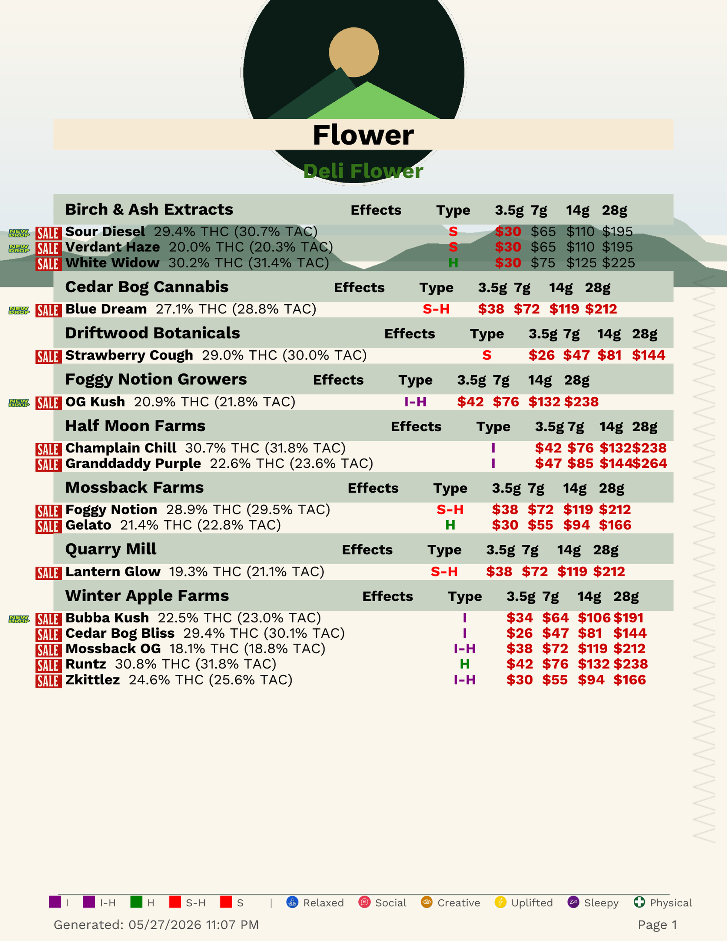
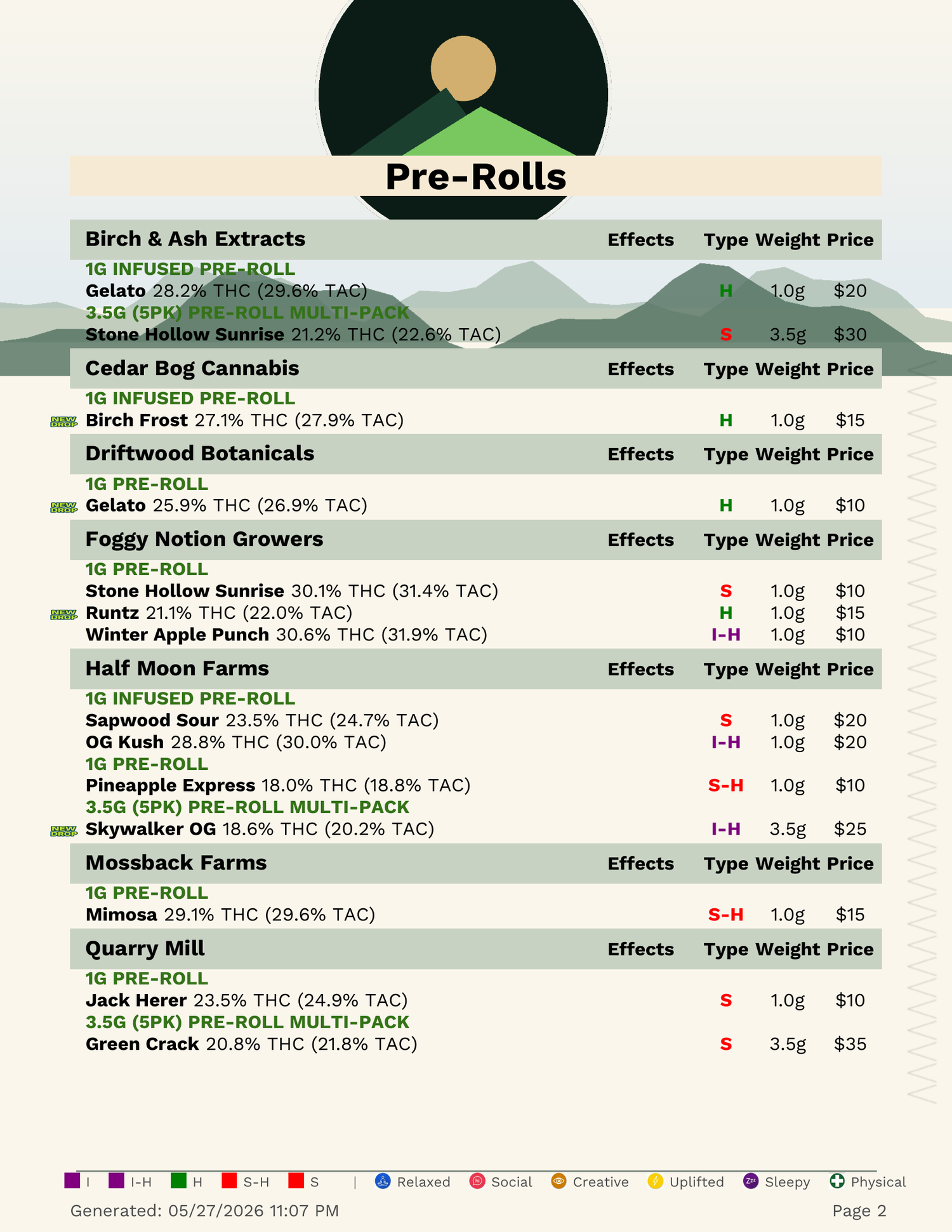
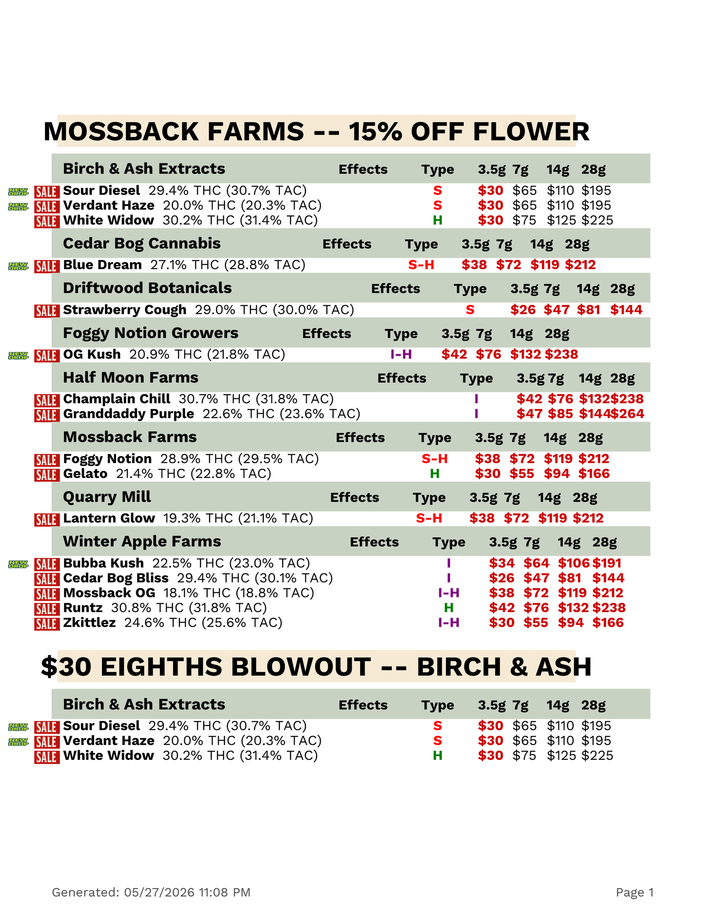
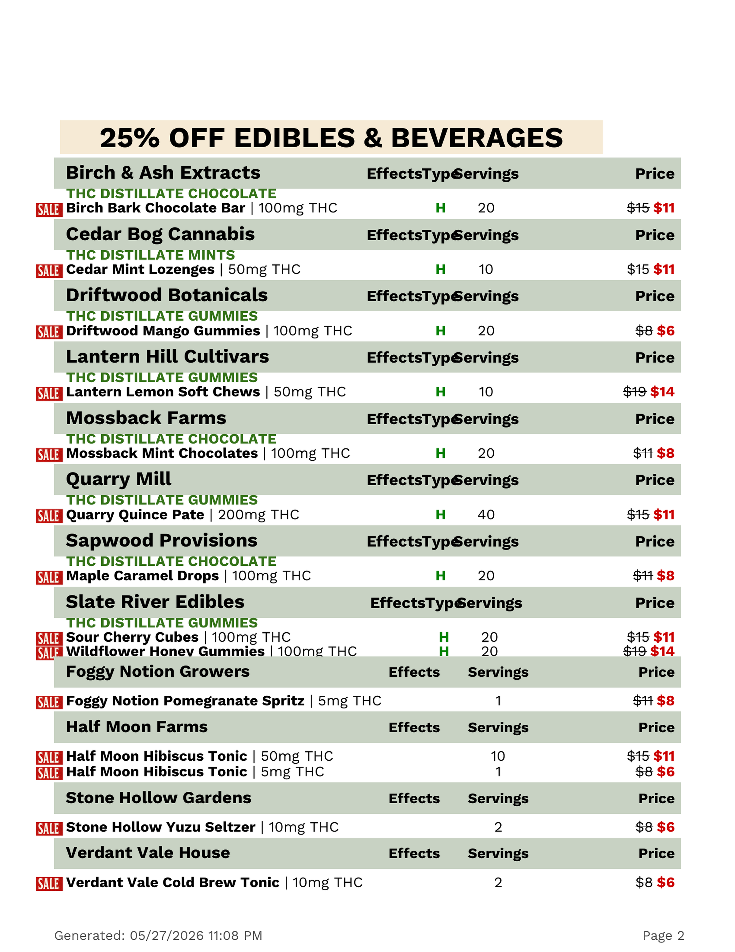
The full menu for the counter. The campaign flyer for the window. The blowout sheet for the wall by the door. Designed once, prints on your office laser any day of the week, never wrong about today's price.
Paper that reads the same shelf as the TVs. Print one, print all -- and the counter handout will never quietly disagree with the bud bar overhead.
The full menu, the discount campaign, the clearance shout, and the retro print-out -- each one printed on the office laser with the data already correct. Pick the surface the customer needs in their hand.
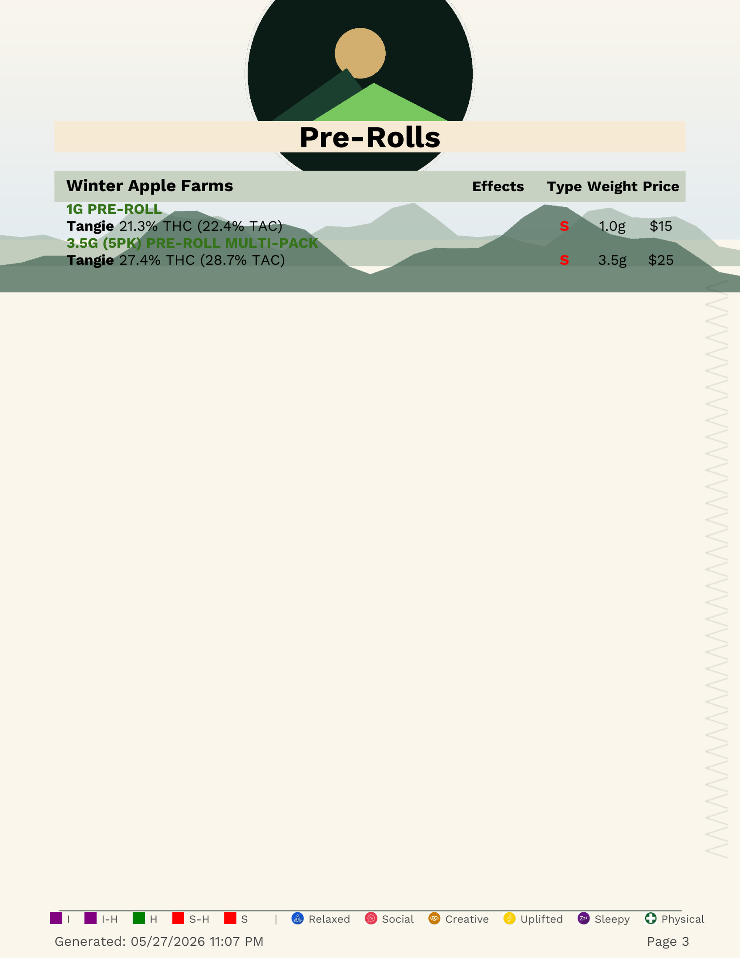
Full inventory, vendor-grouped, 4-tier prices, strain-type color chips, effect legend at the footer. Restrained type, generous spacing.
Promotion-led aesthetic. Every active discount called out, vendor-rows grouped, strikethroughs loud, weekly-sale energy.
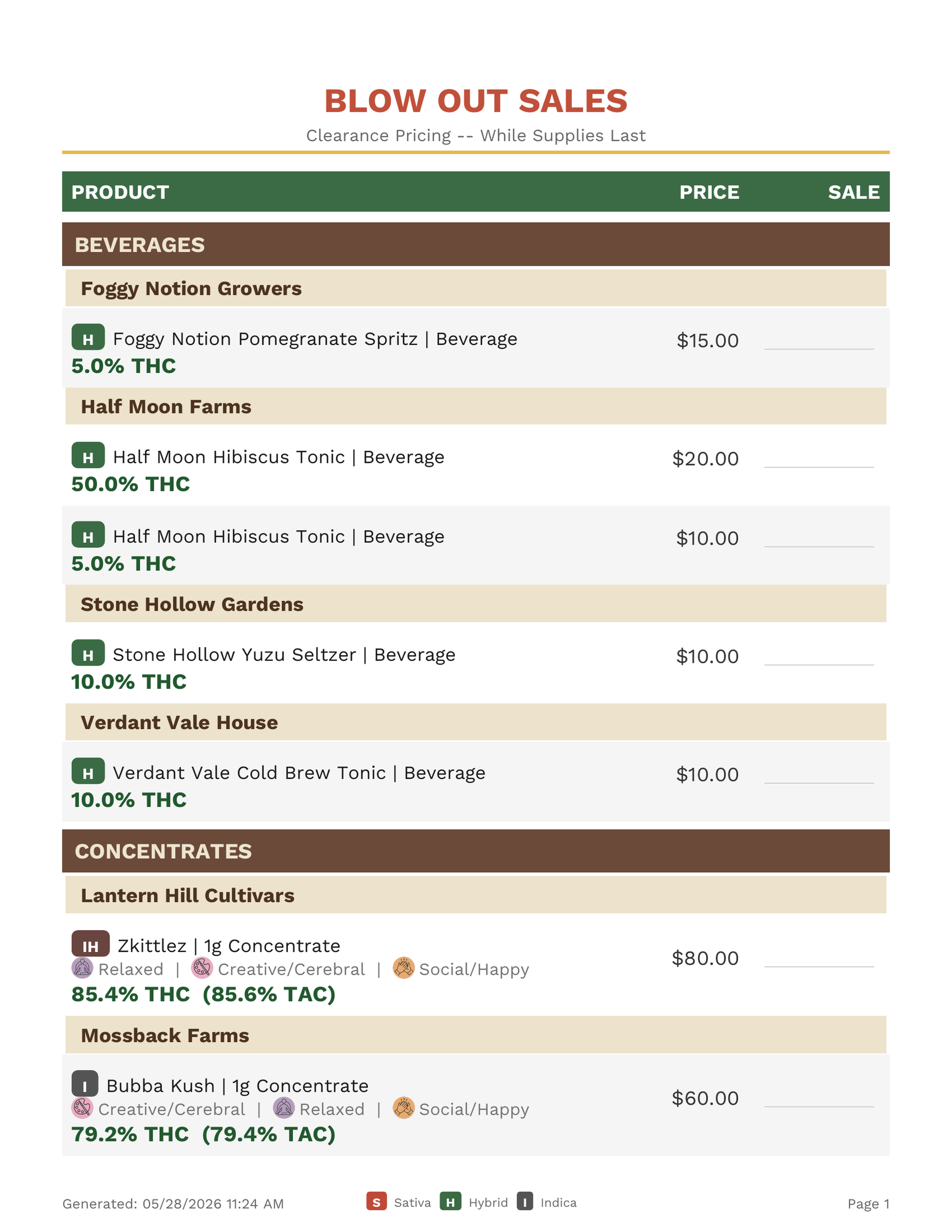
Move-it-now SKUs in big red. For the wall by the door when the freezer's full and the boss wants it cleared by Friday.
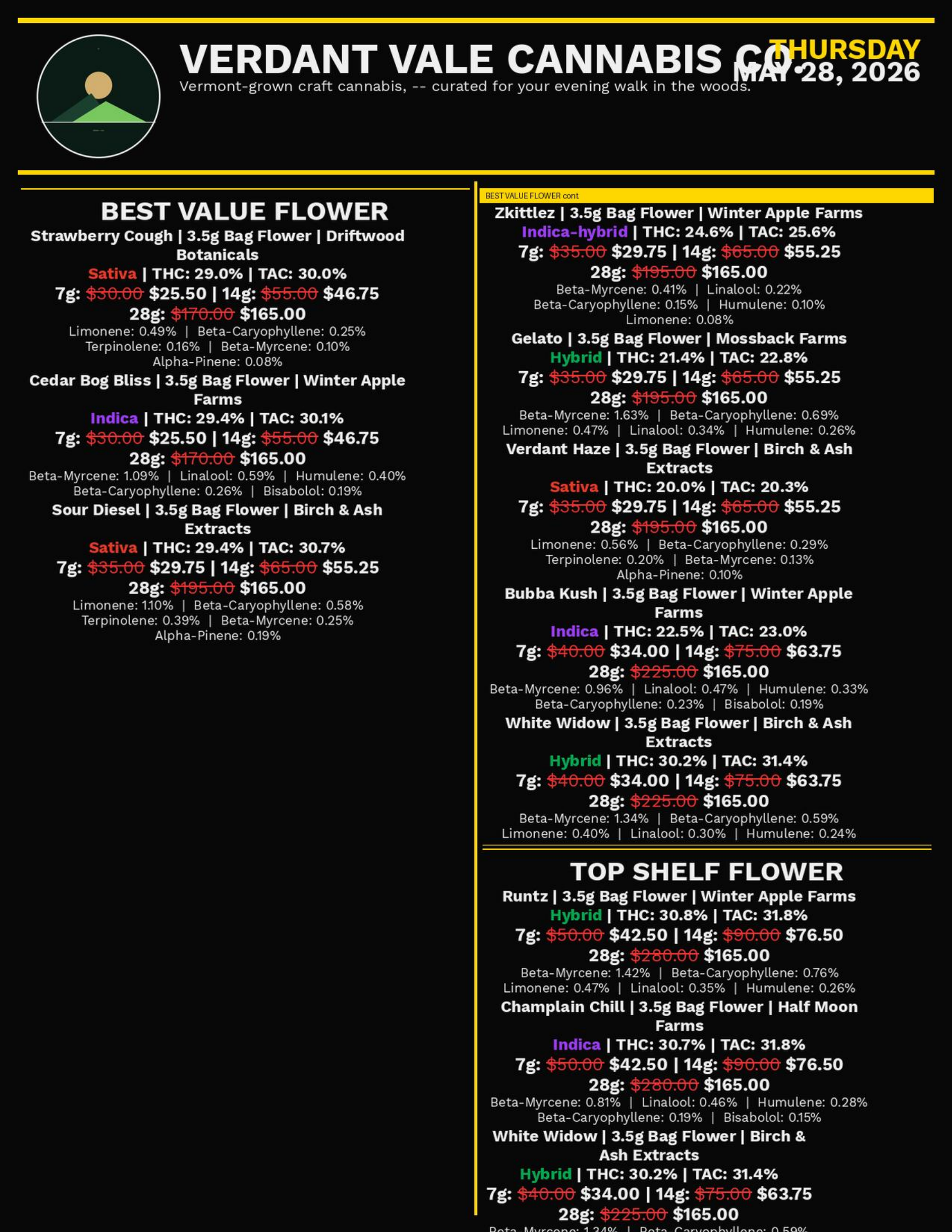
Intentionally not modern. Grid-heavy early-2000s aesthetic for shops that lean into the print-shop print-out feel.
One shelf, four ways to print it. The page that fits the room.
Generous type, clear hierarchy, real cannabinoid data, prices a customer reads from across the room. The kind of paper menu that makes people pick it up off the counter on the way out.
A separate sheet for the daily blowout, the weekend special, the move-it-now SKUs. Red, loud, unmissable -- and pulled live from the discount you just flipped on at the counter.